Color plays an integral role in how visitors understand your website. No matter what you sell, your brand must use the right combination of colors to effectively communicate its story.
Color psychology helps your team portray specific emotions to your audience. It also can encourage (or dissuade) visitors to take a particular action. With certain colors, you can boost your marketing goals.
In this post, you’ll learn about color psychology and ways to incorporate color into your website design.
What is Color Psychology?
Color psychology is the science of how colors influence human behavior. Every day, we interact with a multitude of colors that affect our emotions and attitudes.
These colors even determine our purchasing decisions. That’s why it’s so important for brands to be selective in how they choose their brand logos, store displays, and website designs.
“The right colors can strengthen brand identity and its perception in the minds of customers. Brands can communicate through their colors without actually having to communicate at all,” says Geet Bagrodia, founder and CCO of Vowels.
However, there’s no exact formula for picking the perfect colors. Color meanings vary based on individual and cultural norms. Here is a chart displaying the positive and negative meanings of 12 different colors.
5 Ways to Use Color Psychology in Website Design
Color can influence how consumers think about your brand. Let’s explore five ways to add color to your website design.
1. Website Background
Your customers assess your website as soon as they land on the homepage. Colorcom reports that consumers “make a subconscious judgment about a person, environment, or product within 90 seconds of initial viewing and that between 62% and 90% of that assessment is based on color alone.”
Often overlooked, the background color serves as the central piece of your website design. The color you choose will determine the color of the text, icons, and buttons. The background color also helps with readability.
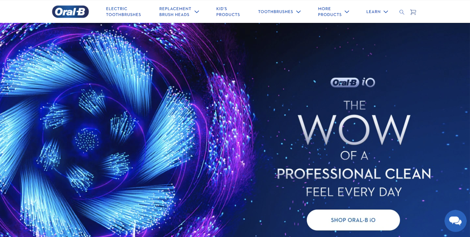
In the example below, Oral B uses a dark blue background as part of its homepage. This color matches its logo and conveys trust and professionalism in the dental industry.

What’s the color of your current site background? It may be worth conducting a focus group to get honest feedback from your visitors.
2. Website Headlines
Color psychology goes beyond choosing the right colors. You also must select colors based on the context of your marketing efforts. Your team should consider where the color will be used and how you want consumers to feel when viewing that specific color.
Then, you can take it a step further and add your brand guidelines. Hammad Akbar, founder & CEO of TruConversion offers insight:
“Just make sure that you compliment your brand personality with the help of your color selection and you also grab the highest attention by the users.”
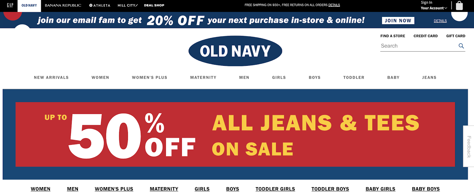
Old Navy’s website headline displays this principle in action. The headline text appears in white and yellow with a red background and a navy border. It grabs the visitors’ attention, so they can learn about the current product sale.

3. Website Hero Image
A hero image is a large banner image pinned to the header section of your homepage. It’s the first thing visitors see when landing on your site.
Hero images matter because they often convey a unique selling point about your brand. It may highlight your brand story, showcase your product, or give visitors a virtual welcome.
Review42 reports that “color influences 85% of shoppers’ purchase decisions.” So, if the goal of your hero image is to drive more sales, you should carefully think about how the color will influence your potential customers.

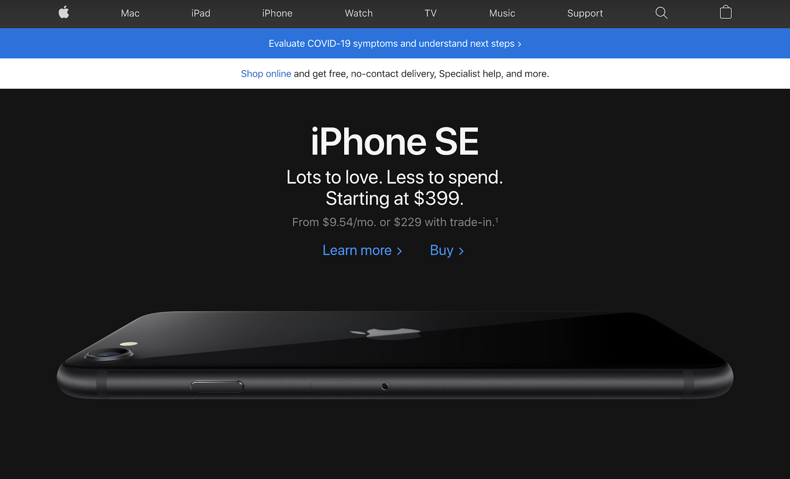
In the example above, Apple uses it’s black iPhone SE along with a reflection to underline the product’s design. This hero image accentuates the detailed features of the phone to encourage purchases.
4. Call to Action Buttons
Your website’s purpose involves more than brand awareness. If you’re looking to bring in revenue, your website needs to persuade people to take action. That action may include signing up for a product trial, subscribing to a newsletter, or actually making a purchase.
The color of your call-to-action buttons must be prominent and easily recognizable. Yet, it shouldn’t be disingenuous to your brand. Raul Harman, editor in chief at Technivorz, provides more advice:
“Instead of simply copying big brands in your industry, be brave and creative. This is the only way to build an authentic brand and set yourself apart from others.”
Take Monday.com’s call-to-action buttons as an example. Their team uses the hot pink from part of its logo as the color of the buttons. Visitors can quickly see what they should do next when arriving on the homepage.

5. Website Pop-Ups
Pop-ups are an effective marketing tool for enhancing the visitor experience. They help your brand target consumers with relevant offers, special sales, or even email sign-up opportunities. It’s another way you can move visitors into your nurturing cycle.
But have you ever thought about the colors in your pop-ups? Probably not. Research shows color improves brand recognition by up to 80%. So, it’s in your best interest to use on-brand colors in your pop-ups.
Quickbooks executes this technique with its pop-up offering a free 30-day trial. You can see the green button along with actual greenery in the image.

Consider how you use color in every aspect of your pop-up design. It can help your brand convert more visitors into leads.
You don’t have to start from scratch when choosing your colors for your website. Ready-made color palettes are available online to help you with this process. Check out the resources below.
- Paletton: This color picker offers presets, color tables, and website examples for beginners.
- Flat UI Color Picker: Explore a collection of color models with the option to copy and paste the color into your work dashboard.
- Adobe Color CC: You can create a variety of color palettes, including analogous, monochromatic, triadic, and complementary.
- Check My Colours: Determine whether your website provides sufficient contrast when viewed by someone having color deficits.
- Material Design Palette: Pick two colors and get a downloadable color palette with eight matching colors.
- Colorion: You can search base colors and their related palettes.
Designing Your Website With Color in Mind
Color psychology impacts how your visitors perceive your website. Be mindful of what colors you use to effectively communicate your brand message.
Want to see what great web design can do for your business? Get in touch with Virtue Media’s web design experts.


![Yes, B2B Websites Can Use Personalization Too [Here’s How]](https://mdvirtue.com/wp-content/uploads/2022/02/Yes-B2B-Websites-Can-Use-Personalization-Too-Heres-How-400x250.jpeg)

0 Comments