Website accessibility is getting a makeover this year, so get ready to update your site. Accessibility is a big issue for users with disabilities, a group that includes 26% of American adults, according to the CDC. It’s a big issue for site owners, too, because if your site is hard or impossible for people to use, they’ll take their business somewhere else.
ADA website compliance is a legal requirement for businesses with 15 or more employees and those that offer public accommodations to consumers like a brick-and-mortar conference space or store.
But even the smallest business and least tech-savvy site owners can make accessibility improvements with the free resources and tools available now.
If you’re not up to speed on what’s required and recommended now, start by finding out what every website owner needs to know about ADA compliance. You can also find the most comprehensive web accessibility resources, including accessibility fundamentals, at the World Wide Web Consortium (W3) Web Accessibility Initiative.
If your site already meets W3’s current Web Content Accessibility Guidelines (WCAG 2.1), then you only need to get ready to implement the new success criteria that WCAG 2.2 is expected to roll out this summer.
What’s in the next accessibility guidelines update?
W3 is developing the WCAG 2.2 guidelines to improve user experience for people with low vision, cognitive or learning disabilities, and/or disabilities on mobile devices.
As of this writing, there are nine new success criteria in the works. Here’s what they are and what they may mean for your website — keeping in mind that they’re still a work in progress.
- Accessible authentication: Do site users need to perform a cognitive task to log in to your site, like typing in characters or solving a puzzle? If so, there should be an alternate way to log in, like autofill by a password manager or copy-paste. CAPTCHAs should focus on recognizing common objects instead of solving math problems or entering characters.
- Dragging: Does your site require users to make dragging movements with their fingers or a mouse? It should also be usable with a pointer alone, to include users who don’t their hands to navigate the web.
- Findable help: Put your help options (phone, email, chat, knowledge base, etc.) on every page in the same format.
- Fixed reference points: If your site includes digitized versions of print books or articles with page breaks, the page numbers on the digital version should match the print edition.
- Minimum focus appearance: You may not know the term keyboard focus indicator, but you’d recognize it if you saw it.
When tabbing or mousing to a page element, like a form field or a hyperlink, changes its appearance, that’s what the focus indicator is focusing on. In WCAG 2.2, the keyboard-controlled focus indicator may need to meet specific requirements for size, contrast and visibility.
- Enhanced focus appearance: This builds on the minimum focus appearance guideline above, with higher contrast and larger minimum size.
- Hidden controls: Any controls your users need to move through your site or do a task should be visible when they’re needed, without making users hover or keyboard focus to access them.
- Pointer target spacing: A target here means an area on your site that users can act on using a pointer, like a product photo they can point at to enlarge it. The recommendation here is that each target area is at least 44 CSS pixels high and wide, with no other targets inside its area. For example, if you have a pop-up that overlaps another target, that creates usability problems.
- Redundant entry: If your site users are completing a process like registration or checkout, don’t make them enter the same information more than once. Previously entered info should auto-populate or be available to select. This is also a best practice for reducing cart abandonment on eCommerce websites.
Now that you know what to do, how to do you do it? We’ve rounded up some WordPress and general tools to help you create a better experience for users with disabilities.
WordPress accessibility resources and next tasks
Got a WordPress site? There are plenty of resources to help you make your site more accessible.
Best practices for accessibility on WordPress
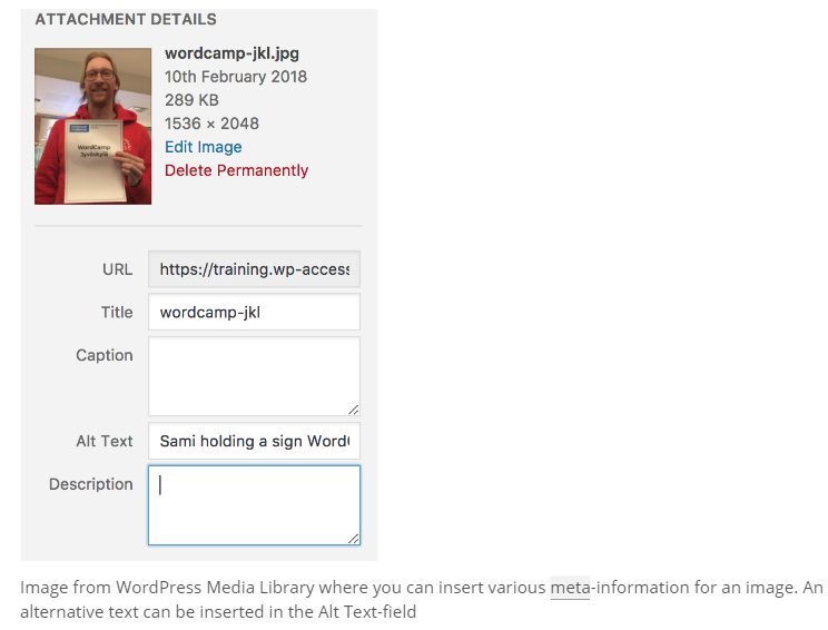
The WordPress Accessibility Team’s best practices handbook covers the basics. In clear terms that are easy for non-tech people to understand, it describes ways to make your site markup, design and content more accessible. And it includes examples and suggestions for further reading if you want to learn more.
Accessible WordPress themes
Using an accessibility-ready WordPress theme can help you make sure your site follows best practices for navigation, contrast and other issues.
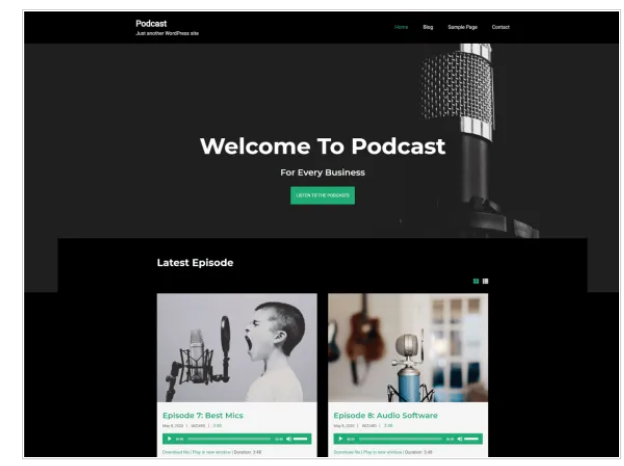
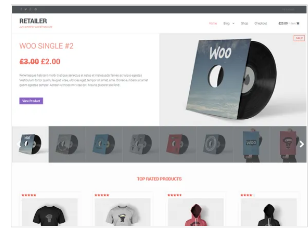
There are more than 100 themes on WordPress.org right now that meet these requirements, including themes for blogs, visual portfolios, podcasts and ecommerce.
Plugins to check and improve your WordPress site’s accessibility
Don’t want to switch themes, or can’t switch just yet? The free WP Accessibility plugin can help you fix some of the most common theme accessibility issues by:
- Adding capacity for long descriptions to images
- Labeling WordPress form fields
- Including post titles on “read more” links
- Testing color contrasts
The publisher notes up front that this plugin can’t fix every accessibility issue, but it can help you start making improvements and identify things to correct.
Want to check your entire site for accessibility? There are two plugins you may want to check out:
- Accessibility Checker automatically scans each new post and site edit, compares your content to more than 40 Web Content Accessibility Guidelines, and lets you know what to fix and how to do it. The premium version adds bulk scanning of all your site’s posts or pages and supports WooCommerce.
- WP ADA Compliance Check Basic offers content scanning functions similar to Accessibility Checker. Its paid version scans your whole site, including “theme files, widgets, shortcodes, custom fields” and more.
More accessibility resources for your website
Register to use the free University of Illinois Functional Accessibility Evaluator and you can scan up to 25 pages of your site. You’ll get a report in a couple of minutes, with links to explanations of how to fix problems with site landmarks, headings, links and more.
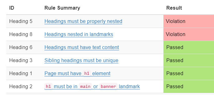
For example, my portfolio website has some heading issues I didn’t know about. This tool is detailed and helpful — if you’re comfortable sorting through lots of tables.
If you’d rather get more visual feedback on your site’s accessibility performance, WAVE from WebAIM and Utah State University is a free tool for checking individual pages.
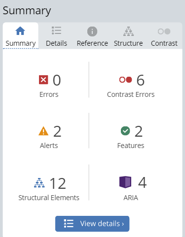
It uses icons to show you exactly where the problems are on your site and tells you what to do. If you have a small website, you could easily check your whole site just using the free version of WAVE.
Like SEO and cybersecurity, accessibility is a process, not a one-time task. Keep learning, keep improving and you can keep more visitors coming back to your site.
Need more help designing or redesigning your website? Learn what Virtue Media Web Design Services can do for you.



![Yes, B2B Websites Can Use Personalization Too [Here’s How]](https://mdvirtue.com/wp-content/uploads/2022/02/Yes-B2B-Websites-Can-Use-Personalization-Too-Heres-How-400x250.jpeg)

0 Comments