


Human brains have their limitations. Some concepts we can’t fully grasp with words alone. Some things are simply better conveyed through visuals.
A good visualization can take a concept that you think you already understand on some level, and reveal it to you with a whole new level of clarity. Maybe you already believe in climate change and get that the world is warming, but seeing xkcd’s comic on the topic puts it in a whole new perspective.
Or you understand that bottled water leads to a lot of plastic consumption, but Reuters’ Drowning in Plastic visualization helps you really see it in a way you couldn’t before.
Data is powerful. But sometimes, when that data’s in number form, its power pales in comparison to what a well designed visualization can achieve.
3 Reasons to Use Data Visualizations on Your Website
Data visualizations aren’t just for high-level concepts. Many types of information can be effectively communicated with data visualizations. And your websites may be able to add something useful and attractive to your overall design by including data visualizations.
Here are a few good reasons to consider using data visualizations on your website.
1. They convey useful information in an understandable way.
Data visualizations are good at taking concepts that don’t feel entirely tangible when described in words or numbers, and making them feel real to your audience.
Take, for example, the idea of a billionaire. We all know a billion dollars is a lot of money, but multiple designers have taken a crack at using visualizations to enable people to better understand just how much it is. Check out this one, for instance, or this one:
Really puts it into perspective in a way the word “billion” doesn’t, huh?
In many cases, using a data visualization can make the information you’re seeking to provide both easier for your visitors to grasp and more memorable. That can make the point you’re trying to get across on your website that much more powerful.
2. They look good.
Data visualizations are frequently beautiful. In addition to being informative, they offer an aesthetic experience. The dataisbeautiful subreddit is entirely devoted to this idea.
A website’s appearance plays a big role in how people perceive and interact with it. And while you have a lot of different design trends and tactics you can consider to make your website look awesome, data visualizations are one more visual component you can add to make your website look good.
3. They make you look good.
If you see a good looking data visualization on a business website, you probably assume the website you’re looking at is legit. If they have the knowledge and skills to compile that data and turn it into a great looking design, they’re probably a reputable company.
Including data visualizations on your website makes you look smart. It shows you not only know your stuff, but also that you know how to communicate it visually in ways that make your message stronger. That adds up to making your website more reputable in the eyes of visitors.
7 Examples of Data Visualizations
To help you visualize (heh) the different ways you can use data visualizations and the range in types of knowledge they can portray, we’ve collected a few good examples of the forms they can take.
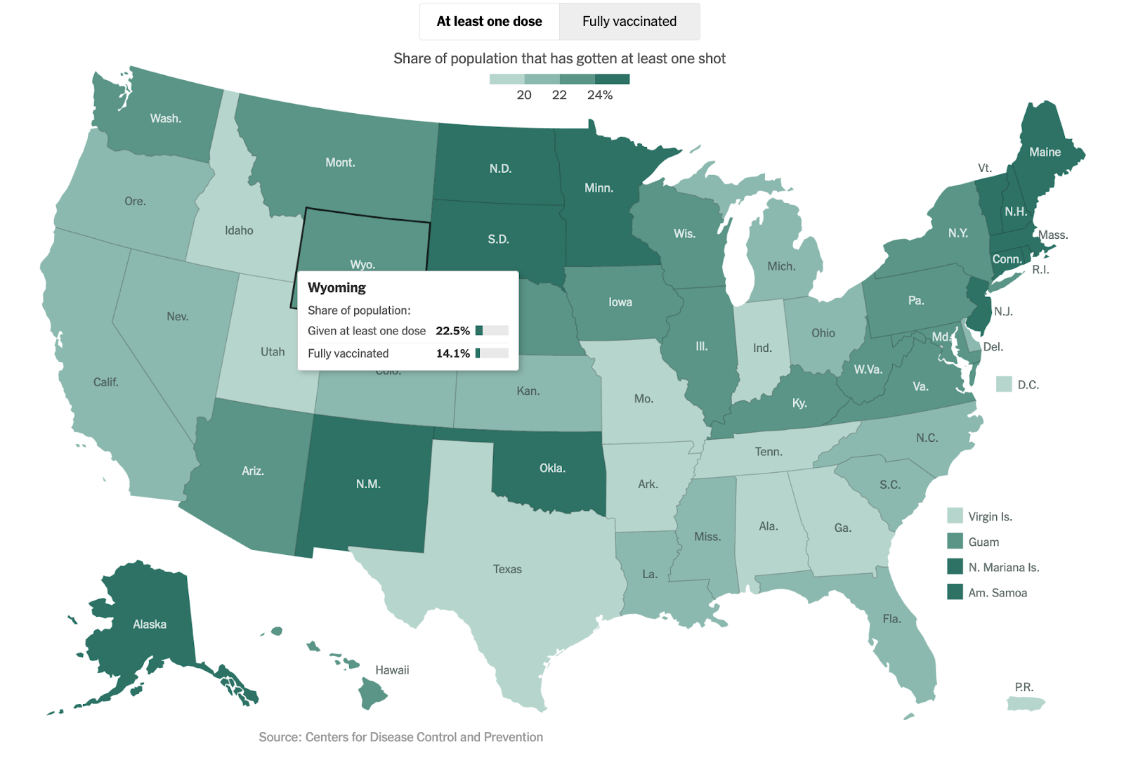
The New York Times’ COVID-19 Coverage
The novel coronavirus managed to affect pretty much every part of life for most individuals, and yet has had a scope that many have struggled to fully grasp. To help readers better understand a number of the facts and figures related to the virus, The New York Times has been offering up data visualizations throughout the pandemic that help illustrate what’s going on.
At the time of this writing, that includes up-to-date coverage on the vaccine rollout. Their charts, graphs, and maps demonstrate how many people are vaccinated, broken down by geographic regions and day-by-day, to make it easier for readers to see the larger trends behind the anecdotal data we’re all hearing.
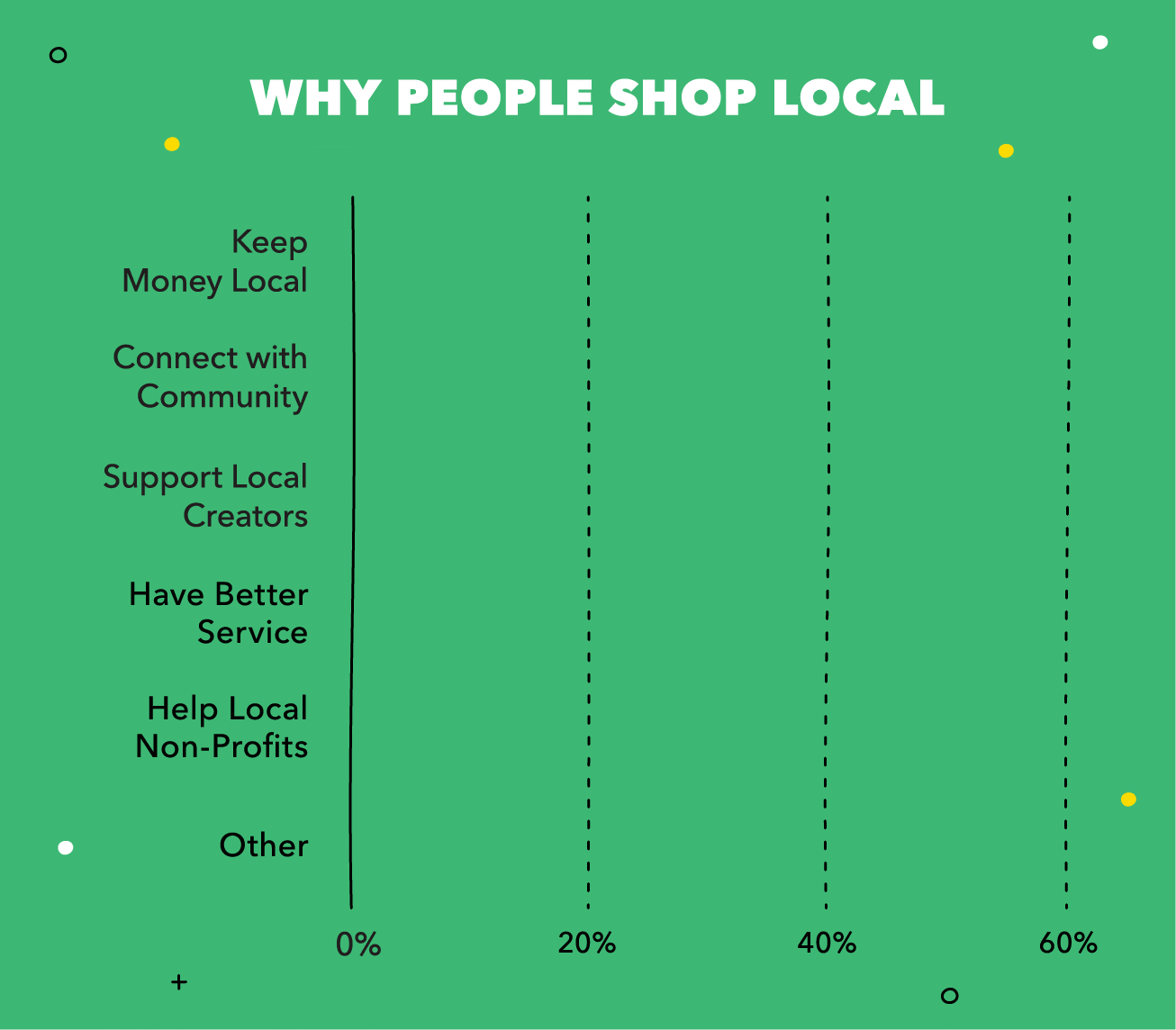
Mint’s Buying Local Statistics
On an individual level, Mint provides data visualizations that consumers can use to better understand their own spending and finances. They applied that same skill to creating visualizations for a survey they performed about people’s local shopping habits.
While the graphics they created from the survey are fairly simple and straightforward, they get the job done, while adding some visual flourishes to keep reader attention. For example, see the basic animation in their “Why People Shop Local” graph. It draws your eyes, doesn’t it?
Visual Cinnamon’s Why Do Cats and Dogs
Designer Nadieh Bremer, who works under the brand name Visual Cinnamon, partnered with Google News to create a fun and gorgeous interactive data visualization that captures the questions people ask about cats and dogs.
The project uses data from Google searches to visually convey the most common questions people ask about the main two types of household pets.
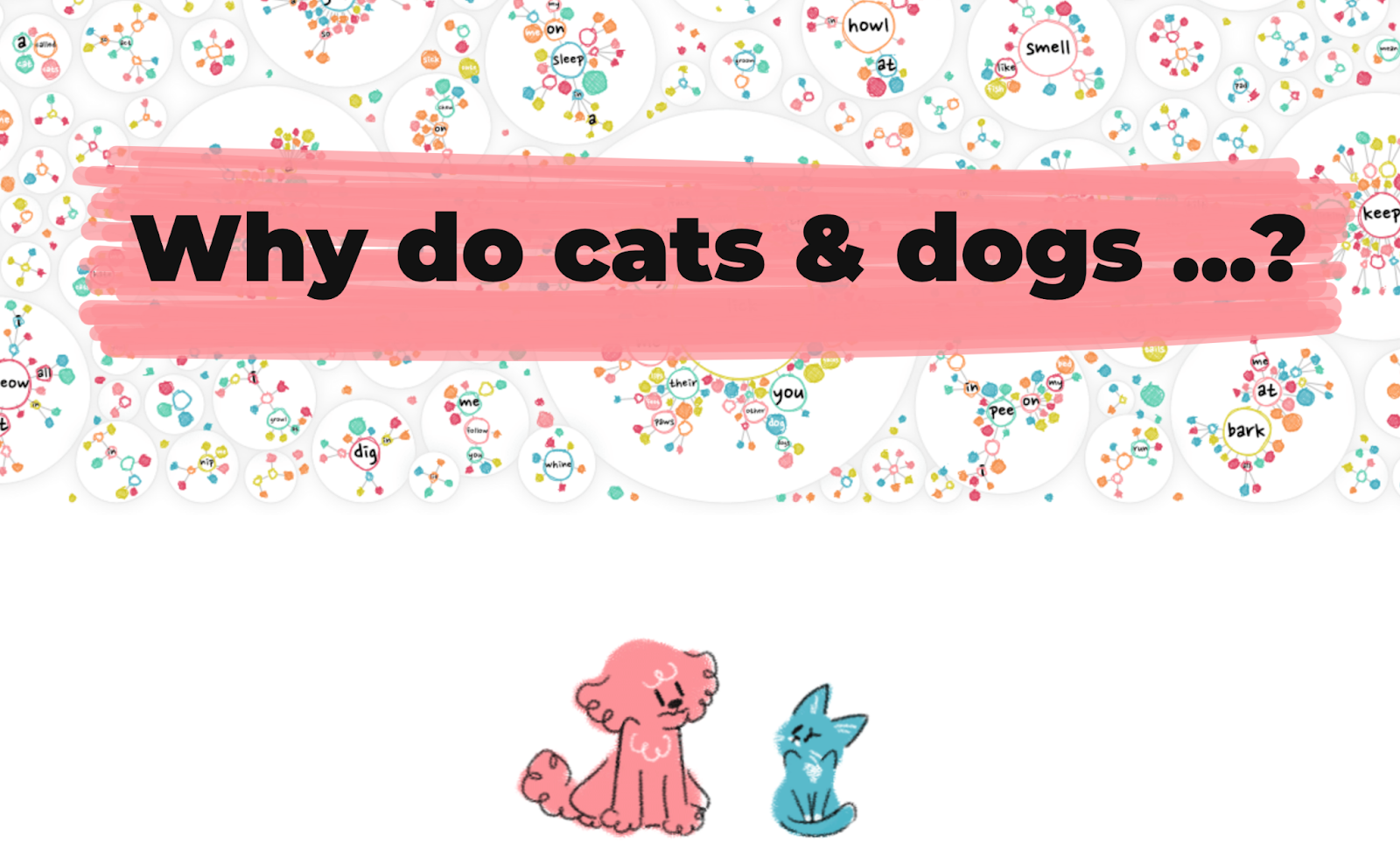
(Fun fact: did you know cats apparently hate cucumbers? The things we learn from data visualizations.)
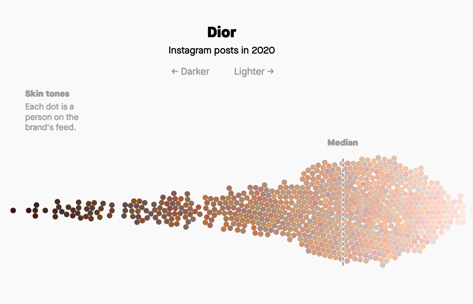
Quartz’s Fashion Brands BLM Analysis
In June of 2020, many brands loudly proclaimed their commitment to the Black Lives Matter movement by posting black squares on their social media profiles and releasing statements of support. Quartz wanted to follow up months later to see how well the images they put out on their profiles matched their publicly stated good intentions.
To do that, they analyzed the skin tones of the models in photos shared on the Instagram profiles of various fashion brands. While racial diversity in the models chosen is only one measure of the work a brand can do to support racial justice, it turns out to be a telling one.
The data visualizations Quartz created to illustrate what they found show a clear picture of the brands’ preferences toward lighter skin tones, with minimal change in that trend in the months since voicing support for the BLM movement.
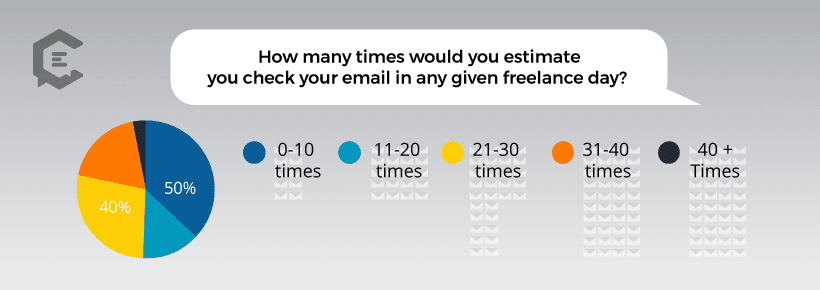
Freelancers have the power to organize their day as they see fit—for better or worse. To gain some insights into how freelance professionals typically spend their time, Clearvoice performed a survey and turned the responses into data visualizations.
They covered questions like how many cups of coffee freelancers drink on average, and how often they check their email. Putting this information into visual form allows freelancers to get a quick snapshot of how their typical habits compare to those of their colleagues. And for anyone considering freelancing, it provides a glimpse of what to expect.
The Trevor Project LGBTQ National Survey
The Trevor Project published the results of their survey on the mental health of LGTBTQ youth via interactive data visualizations that really drive home the information included.
The visualizations include microinteractions to help draw attention to the data being shared. And for much of the data, visitors can switch between views that show results for cis respondents versus trans and nonbinary youth to gain more nuance.
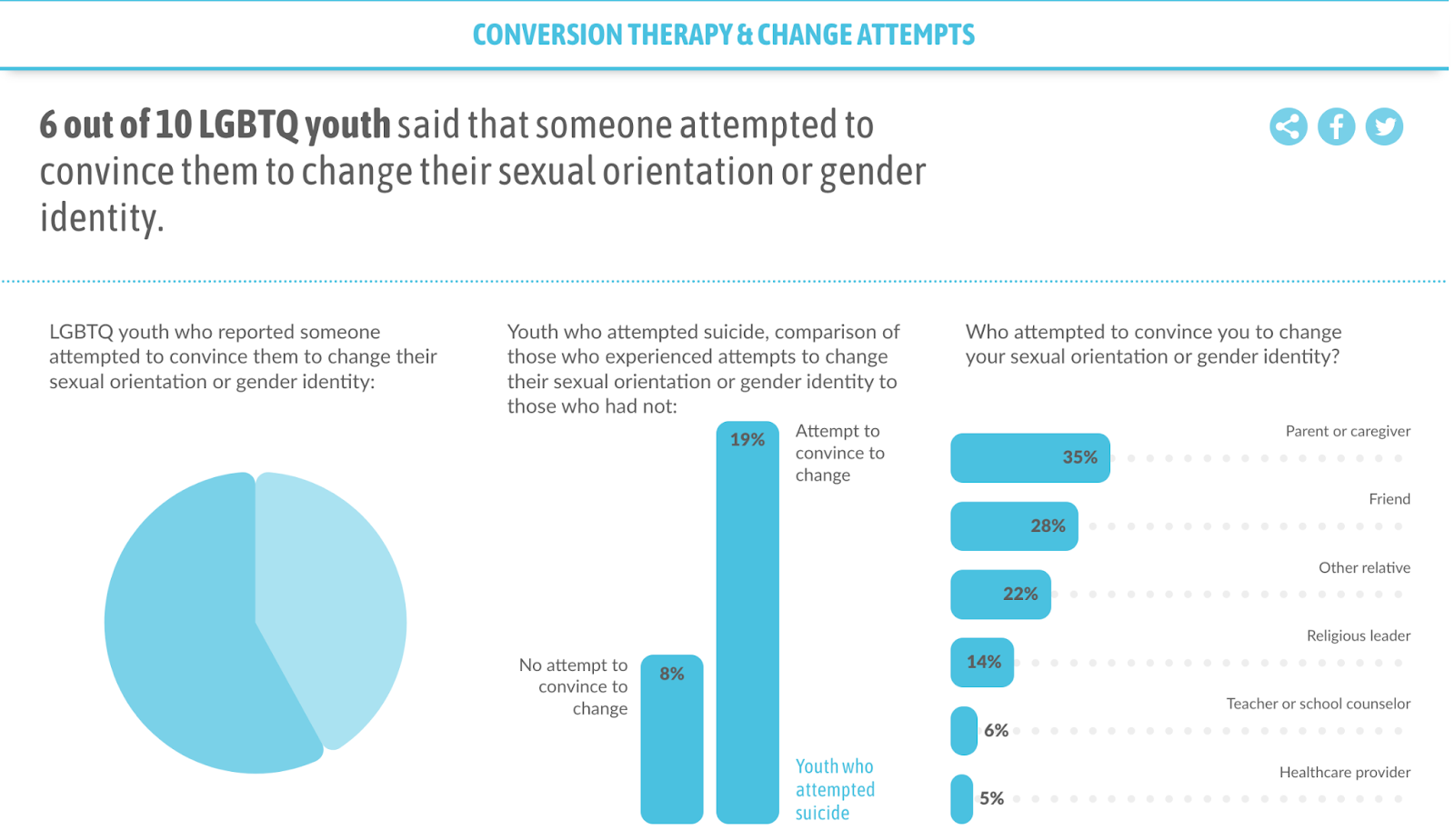
The data gained from the survey is important to helping the larger culture understand how much work still needs to be done to ensure LGBTQ youth can feel safe and healthy. By putting it into a format that draws attention and helps viewers better understand what they’re seeing, the information gains more traction
Pudding’s The Office Dialogue Charts
Many of the examples we’ve looked at here are on the serious side, but data visualization can also be applied to lighter, more fun topics.
The website Pudding put their data analysis skills toward the subject of TV’s The Office. They created a few charts to analyze who does the most talking on the show (Michael), how their percentages of dialogue compare, and who’s the most negative (Angela) vs positive (Andy).
And to round things out, they also did the important work of putting together a chart of every “that’s what she said joke” on the show.
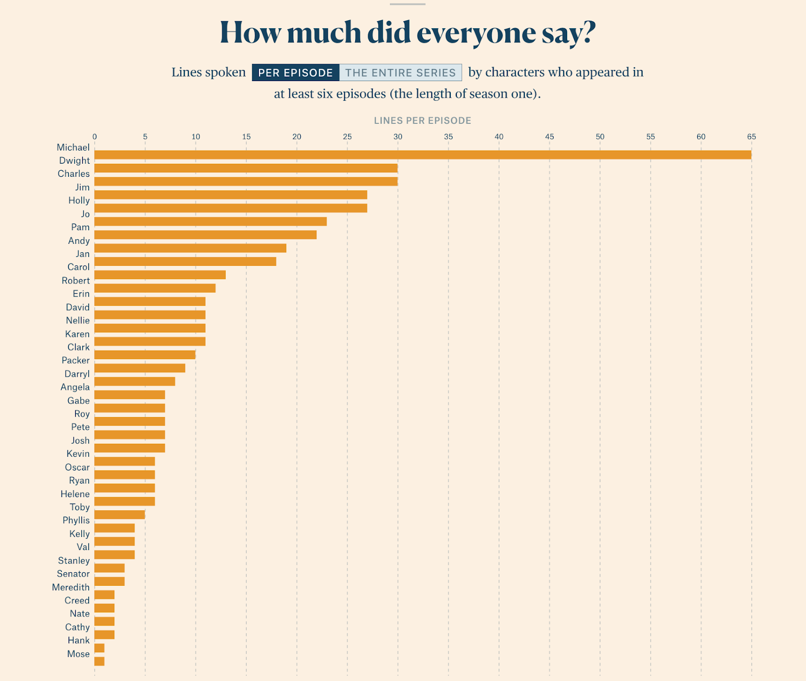
For fans of the show, a lot of the insights revealed in these data visualizations aren’t much of a surprise (of course Angela’s the most negative). But it’s still cool seeing things you already felt were true confirmed in a neat visual representation like this.
So you were wowed by some of those examples and are coming around the idea that data visualizations could really add something to your site. But now you’re stuck at the how part of the equation. If you’re not a designer, and not sure you can afford someone with this specific skill set, creating awesome looking data visualizations may feel out of reach.
But it doesn’t have to be. A number of tools now exist that make it easy for anyone to create data visualizations—even those of us with zero design skill.
Here are a few of the best options for individuals and small businesses that need something affordable and easy to use.
1. Visme
Visme is a tool that makes it easy to create visuals, even if you’re not a designer. That includes data visualizations like charts and graphs. You can start from templates the company provides, or create your own. Once you import your data, the software will translate it into a visual format, but then let you select the visual details, like fonts and colors.
Visme offers a free version that will satisfy the needs of some, and premium paid versions for those that anticipate needing to tap into more features or make more visualizations.
2. Tableau
Tableau is a visual analytics platform. The company’s main products are focused on providing and conveying business intelligence through data. But they also offer Tableau Public, which is a free data visualization app anyone can use—you just have to be OK with your visualizations being available to the larger Tableau community.
With either their paid or free tools, you can import your data from a spreadsheet or fill it in manually and then translate it into a colorful, beautiful visual design.
3. Infogram
Infogram’s a popular data visualization tool that has an easy-to-use interface that’s great for non-designers. They provide templates that make getting started easy, and drag-and-drop functionality to simplify any changes you make to the templates.
In addition, the tool provides the functionality to make your charts and graphs interactive—you can animate them so they slide, fade, zoom, etc. That can make your data visualizations more engaging for visitors. (The Trevor Project example above can give you a sense of what interactive data visualizations look like).
Infogram has a free version you can use for up to ten projects. If you go beyond that the cost goes up to $19 a month.
4. Chartblocks
Like the name suggests, Chartblocks is a tool for creating charts. It’s easy to use—you just import your data, do some basic designing, and you have a data visualization. In most cases, you can create a chart or graph from your data in a matter of minutes.
Chartblocks is great on the ease of use front, but does have more limited functionality than the other tools on this list. You can’t create as many types of data visualizations as some of the other tools allow. But the tool is free to use for up to 50 charts, and intuitive for beginners. If your needs are simple, you can create fast and easy data visualizations with it.
5. Zoho Analytics
Zoho Analytics is a sophisticated business intelligence tool designed to help businesses better understand and share their analytics from multiple sources. While creating data visualizations to share on your website isn’t a main use of the platform, the tool makes it possible to create beautiful data-based graphics that you can then use as you see fit. It can integrate with a long list of other software products that collect analytics, and you can also import data in a variety of formats.
Zoho Analytics has a basic free plan. To tap into more features, their paid plans start at $22 a month.
Make Your Data Beautiful
You don’t have to be a designer to put your data to use creating gorgeous, informative graphics for your website. Data visualization is a smart way to provide useful information to your visitors at the same time that you add some extra aesthetic style to your site. And you can get started creating beautiful data visualizations via a number of intuitive tools that are free.

![Yes, B2B Websites Can Use Personalization Too [Here’s How]](https://mdvirtue.com/wp-content/uploads/2022/02/Yes-B2B-Websites-Can-Use-Personalization-Too-Heres-How-400x250.jpeg)

0 Comments