


This article is part of Virtue Media’s Web Pros Series. In this series, we feature articles from our team of experts here at Virtue Media. Our Product Managers, Linux Administrators, Marketers, and Tech Support engineers share their best tips for getting the most out of your website.
Good design cannot be contained. Good design breaks free. Good design finds a way.
If you need proof, look no further than the Jurassic World website, which is keeping fans entertained and whetting their appetite for post-pandemic thrill rides and an upcoming film.
Take a cue from Jurassic World. Here are 5 design takeaways from their website you can use to make your own site more engaging.
1. That bold hero image is ready to grab your attention and not let go
This hero image—the front-and-center banner—is a great example of using bold and unique imagery to draw in the user, create a jolt of emotion, and motivate them to continue reading your site.
In this case, Jurassic World’s velociraptor pack cavorting around their new ride ticks all the hero image boxes:
- Imagery: Jurassic World fans are going to scan the whole image to look for all four members of the pack—yep, they’re there—and that draws them in.
- Emotion: Those of us who are into and/or terrified of velociraptors and rollercoasters get a zap of adrenaline because holy cats there are velociraptors running amok on that coaster!
- Motivation: By featuring the new Velocicoaster ride that’s debuting at Universal Orlando in summer 2021, this hero image invites visitors to click through and learn more about the new ride or stick around and explore the rest of the site.
Design takeaway: Use custom images (not stock art) to grab visitors’ attention right away, generate emotion and get them to stick around.
2. Playful site navigation immerses visitors in the Jurassic World universe
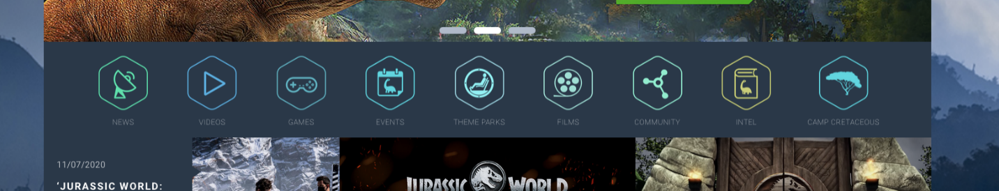
Immersive user experience is a hot trend, and the Jurassic World website gives us a great example of using design to make it happen.
The site’s navigation panel icons, shapes and colors echo the dashboards and computer interfaces in the films, only now site visitors can use them, too. It’s a clever way to invite site visitors to experience Jurassic World for themselves, even without using expensive AR or VR technology.
Design takeaway: Think about how you can make your navigation part of your website’s total experience, instead of having it exist outside your brand.
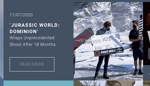
3. The card layout makes it easy for visitors to explore Jurassic World
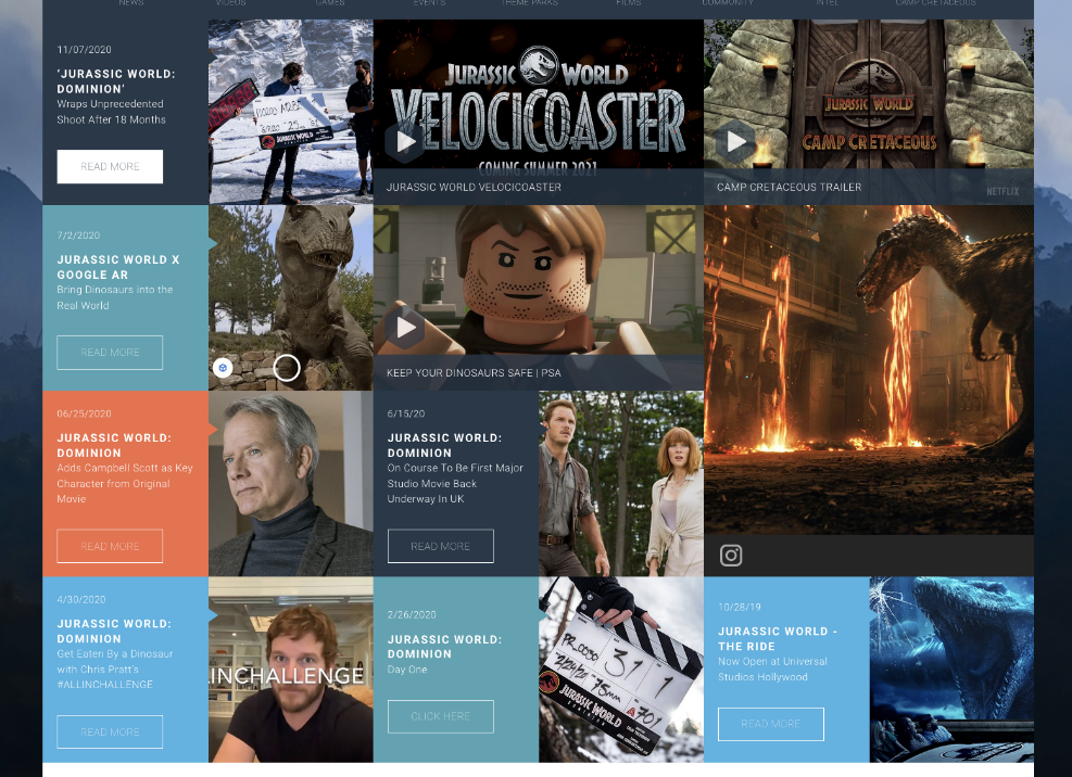
As people spend more time on their phones than at their desks, web designers need to rethink how they design. Now, everything needs to fit smaller device views without sacrificing style or context on any kind of device.
One popular solution is the humble but mighty power card. These simple rectangular shapes can be packed with images, videos and text that get visitors to click or tap through for more.
The Jurassic World website uses power cards to strike a balance between an orderly interface and a good user experience on phones and computers.
Extra points because when you hover over or touch each card, a little motion increases engagement.
Design takeaway: Make it easy for visitors to see what’s on your site at a glance, even on a small screen.
4. The image galleries are designed for exploration, too
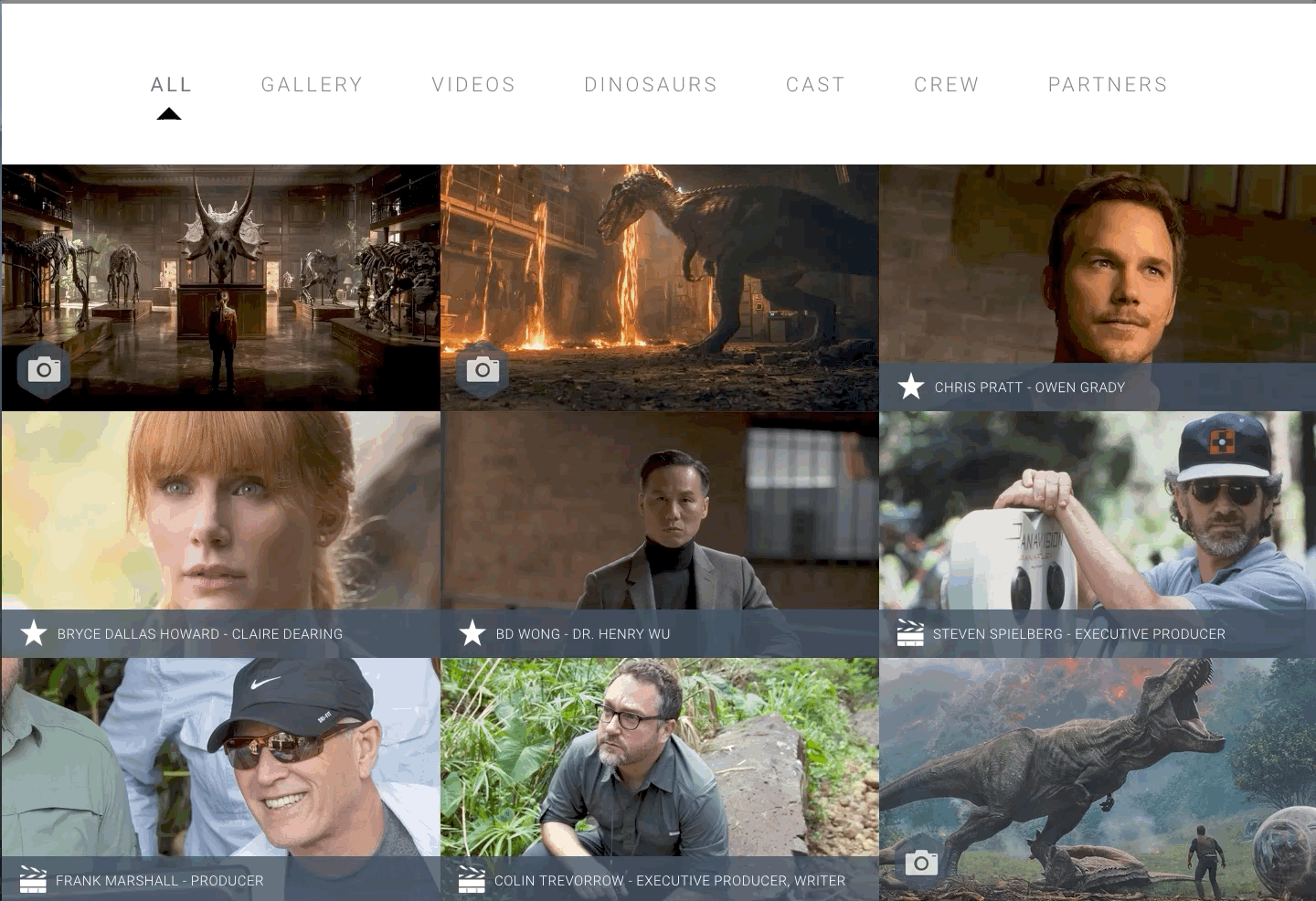
An image gallery is a great way to showcase rich media, but—like a collection of unpredictable genetically revived and modified predators—it can be hard to get image galleries to work right.
A poorly implemented gallery can take forever to load, confuse users about how to move around, and hijack the user’s control through video autoplay. Next thing you know, your visitors are screaming and fleeing.
Jurassic World gets it right, though. The gallery loads fast, and the images are large enough to be clear and easy to engage with. The impact this has on improving website engagement can be huge. Instead of running, visitors are more likely to stick around, explore, come back, and maybe share the experience with friends.
Design takeaway: Optimize your media for fast load times and make your galleries easy to navigate.
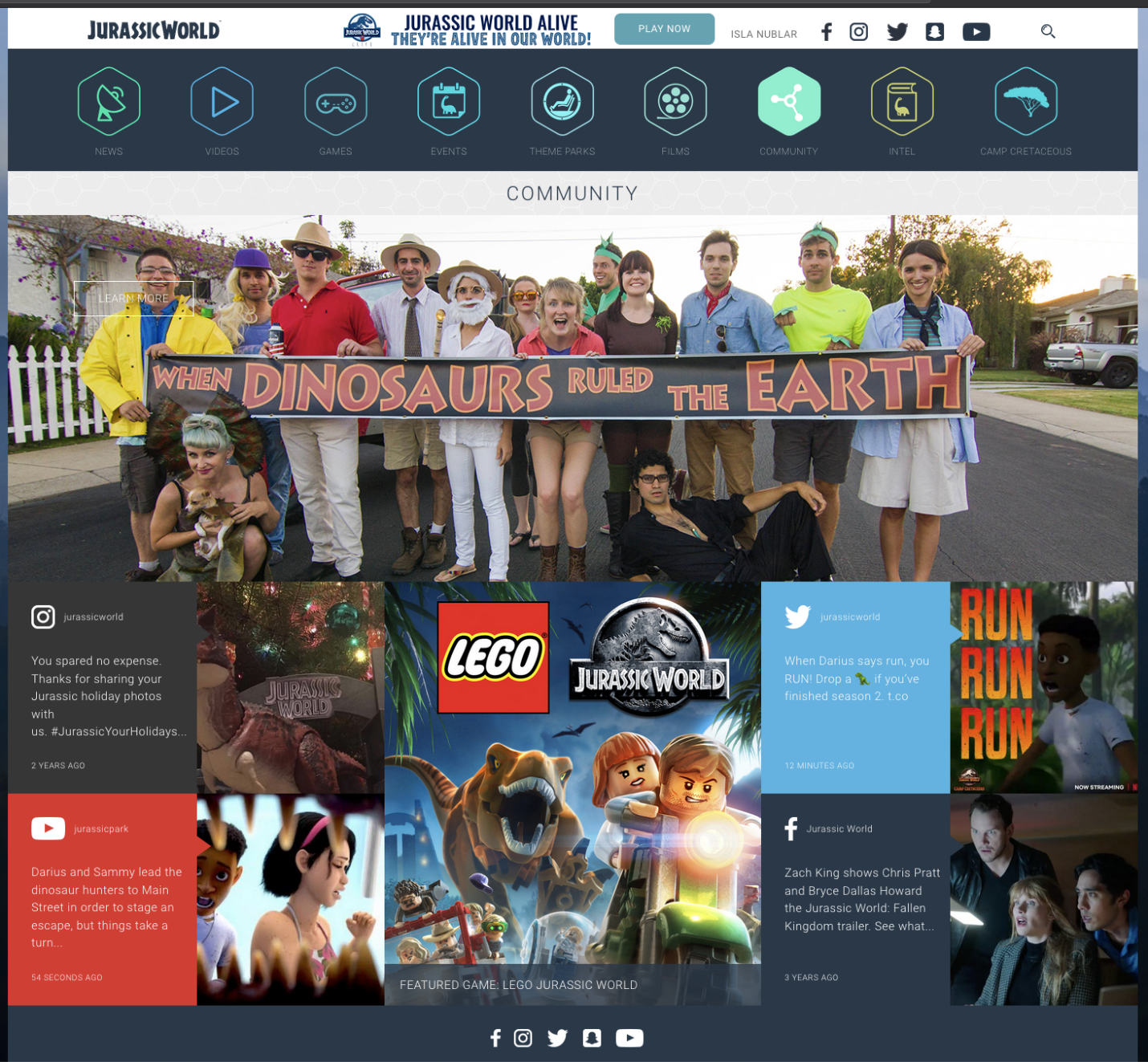
Building a brand requires nurturing a community of fans and customers online. That’s easier for one of the most popular film franchises in history than for the average website owner, but it still calls for good design.
Jurassic World didn’t skimp on helping visitors dive deeper into the fan community. The site features links to their most active social accounts and features content from their social feeds.
Design lesson: Creating and maintaining your brand’s social presence means more than just putting social icons on your site. Show visitors what’s happening there, and they’ll be more likely to check it out.
Need help with your site design? Too busy running your business (or running from raptors) to make design updates yourself? Check out Virtue Media’s professional web design services.


![Yes, B2B Websites Can Use Personalization Too [Here’s How]](https://mdvirtue.com/wp-content/uploads/2022/02/Yes-B2B-Websites-Can-Use-Personalization-Too-Heres-How-400x250.jpeg)

0 Comments