


Think about the last time you were in public with a bunch of strangers. What were people doing when you looked around? I bet you a shiny silver dollar that they had their heads buried deep into their smartphone, checking social media or browsing websites.
If you don’t like to rely on anecdotal evidence alone, recent research shows that the number of smartphone users in just the United States is over 257.3 million. That’s nearly 80 percent of the total US population.
All of this is just to say that if you have a blog or website, or are planning to launch one soon, and want to capture the attention of smartphone users, you have to make your website mobile-friendly. In other words, you have to make it possible for smartphone users to easily read and navigate your website from a mobile device. None of this pinching, scrolling, and zooming business!
This post will provide the top seven mobile-friendly design tips for your blog or website.
1. Pick a mobile-responsive website or blog theme
No one said you had to be a web designer to have a mobile-friendly website. They did say, however, that you have to be picky when it comes to choosing a theme. Save yourself a headache and pick a mobile-friendly theme.
As a quick review, a theme is a preconfigured framework that defines how your website looks. Mobile-responsive themes are pre-coded for both optimal desktop and mobile navigation.
If you have a WordPress blog or website, most templates will already be optimized for mobile devices. However, you can double-check by reading the theme description and also by testing the demo URL for responsiveness.
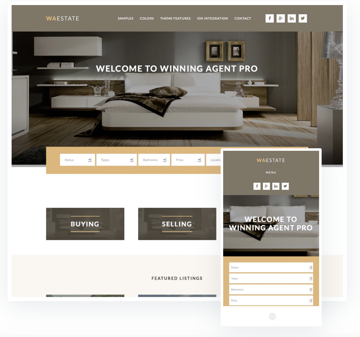
If you buy a third-party WordPress website, the theme product page will usually include a picture or demo of how the theme will look on a desktop and mobile device (see below).
If you’re running your website in Virtue Media, take note that all of our drag-and-drop website builder templates are mobile-friendly.
2. Include a viewport meta tag
If you’re the “I’ll do what you say, no questions asked type of human,” here’s what you need to do:
- Copy. Copy the following code: <meta name=″viewport″ content=″width=device-width, initial-scale=1″>
- Paste. Paste the code in the HTML <head> area for each page of your website.
Tada! You’re done. Pat yourself on the back.
Now the explanation. The viewport code provides search engines with the information needed to correctly display the size and scale of the content, based on what device an internet searcher is using.
Put simply: this meta tag provides a top-notch, multiple-device navigation experience, so website visitors can enjoy your content from a large desktop and a small six-inch mobile screen alike.
3. Simplify your content
Any time you, as an internet browser, navigate a good mobile version of a website, you’ll notice the content isn’t as rich as it is on a desktop.
When creating copy and design elements for your mobile website, the hard and fast rule is: simplify everything.
Here’s what I mean.
When I search Krispy Kreme (I’m not eating a dozen doughnuts, you are!) on my desktop, this is what the home page looks like.
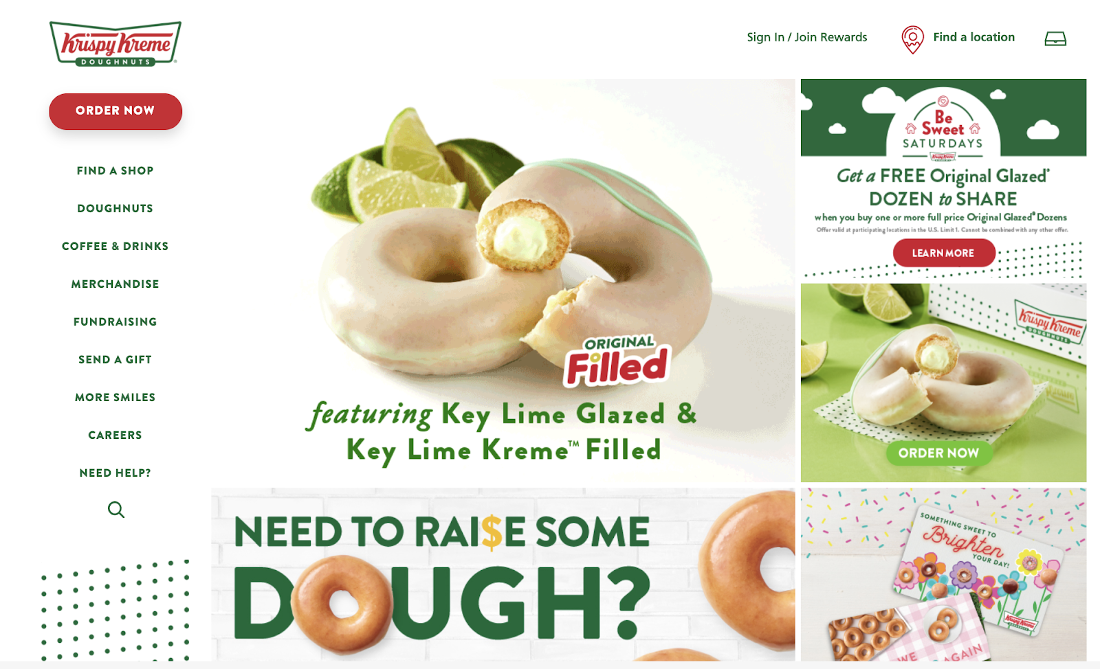
It’s complete and full of all the information you could ever want to learn about these delicious confections.
What happens when I search for the same website via a mobile device? This is how the home page looks now.
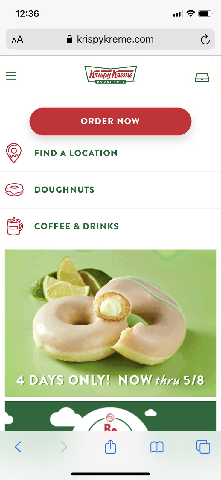
You only see the essentials. Krispy Kreme puts the most important information on the top (“order now”) and eliminates any elements that aren’t critical to a mobile shopping experience. It’s awesome. Do as Krispy Kreme does.
4. Avoid fancy design elements
The goal of mobile search is to get answers from brands as quickly and efficiently as possible. This means when you are designing your mobile-friendly website, you have to let go of all your fancy design ideas and opt for the quick and simple.
Here are the two things to forget about first.
Flash? Just say no.
As it turns out, Flash is not an apt name for the technology. Why? Flash can slow down a site’s load time significantly. The more you can do to speed up your site’s load time, the more attractive your website will be to users.
Additionally, neither Android nor iOS supports Flash. This means if your websites’ mobile experience is dependent on whether or not your viewers can see your Flash animation, you’re going to run into trouble when someone searches via a mobile device.
Avoid the use of pop-ups and refreshers
Pop-ups and refreshers can be a great tool for desktop viewing. They are especially helpful in capturing new subscribers, making announcements, and giving discount codes.
However, these tools are distracting on a mobile device. You want your content to be as simple and easy for your visitors to navigate as possible. If your visitors see irrelevant pop-ups that take up the whole screen, it could lead to a potential customer getting frustrated and clicking out of your website.
Also, have you ever tried to hit the tiny close pop-up “x” on a small screen? It’s impossible.
A smart alternative is to include a small bar at the top of your mobile search page where you include promotions, announcements, or free shipping.

5. Consider the size of your font and buttons
Have you ever visited a blog on a mobile device and had to zoom in to consume the content? How long did you keep reading? Chances are it wasn’t very long.
The font on mobile sites should be at least 14px. This makes it easy for most people to read your content without any problems. If you have any copy that is supplemental, you can keep the font at 12px.
Reading articles on a mobile device isn’t the only time where the size of the design element comes into question. It’s also important to design any clickable buttons correctly.
The last thing you want is for your mobile visitors to have a difficult time selecting products or tapping on buttons. Bigger buttons are best. Shoot for button sizes that are at least 44px by 44px.
44px by 44px is the size of this circle:

6. Compress your images and CSS
Did you know that 47 percent of website visitors expect a site to load in less than 2 seconds, according to Kissmetrics? And, 40 percent of visitors will exit out of the website if the loading process takes more than 3 seconds.
You’ve already avoided using Flash and eliminated distracting elements like pop-ups, but what about images and CSS? Images and CSS take up a lot of server space, meaning they take longer to load. But, you don’t want to get rid of visual design elements that make the mobile user experience better.
The solution is not to leave out images or style sheets, but to compress them. When you compress your image file sizes they load faster without negatively affecting the quality of your site.
7. Include a search function if you sell products on your mobile site
Think about the popular eCommerce platform, Amazon, for a second. There are over 12 million products on Amazon; yet, anyone can find and purchase exactly what they want in a matter of seconds.
One way Amazon accomplishes this is by including a search bar at the top of their mobile app.

You may not have 12 million products, but that doesn’t mean the magic of a search bar can’t help you organize the products you do offer.
Design Your Mobile-Friendly Website
There are over a billion websites in the world, but not all of these websites are created equal. Website owners that work hard to improve the mobile user experience get rewarded with more traffic, referrals, and repeat visitors.
As you design your mobile-friendly website, implement the design tips listed above. These tips will help keep your website working properly when someone comes searching from a desktop or mobile device. You can get started with these responsive web design tools.
Remember, you don’t have to do all the hard work yourself. Virtue Media’s drag and drop website builder is already optimized for mobile viewing. All you have to do is pick a template and customize it to your liking.
Or, you can have our web design pros create a professional, mobile-friendly web design that’s all your own.


![Yes, B2B Websites Can Use Personalization Too [Here’s How]](https://mdvirtue.com/wp-content/uploads/2022/02/Yes-B2B-Websites-Can-Use-Personalization-Too-Heres-How-400x250.jpeg)

0 Comments