


When visitors land on your website, it only takes a few seconds for them to decide whether to stay or leave. So, it’s imperative that your website makes a good first impression.
An effective website design enhances the visitor experience. Your site should make it easy for visitors to read and find content and provide ample white space and images. As a result, you’ll keep visitors engaged with your content.
Check out these seven simple UX tips to elevate the look of your website.
1. Embrace white space
White space is the empty space between the elements on your page. You can have white space between text, graphics, or any other media.
The purpose of white space is to guide your visitors to specific parts of your site. It also makes it easier for visitors to read your content. John Hughes, a blogging addict and WordPress fanatic, agrees:
“The point here is that using enough white space on your web pages is key to making them both visually appealing and easy to navigate. Having enough white space between elements has also been repeatedly shown to increase reading comprehension.”
When designing your website, consider adding margins or padding and using line-spacing within the text. That way, your site isn’t cluttered, and you can maintain your visitors’ attention.
2. Add high-quality images
According to Venngage, 60.8% of marketers believe the use of visual content was absolutely necessary for their marketing strategy. Images play a vital role in helping visitors understand more about your brand.
Before adding your images, you’ll want to follow a few best practices. For starters, adjust the image contrast to make it brighter. Dark images often get overlooked when visitors scan your website.
Next, resize your images to fit the column width of your blog. Visitors shouldn’t have to squint to see your image, and alternatively, the image shouldn’t expand across an entire page. When resizing, keep the proportions the same to not distort your images.
The final tip is to optimize your images to avoid slow load times on your website. You can keep the visual quality high and the file size low by using a tool like Optimizilla.
3. Consider visual and typographic hierarchies
Visual hierarchy informs visitors where to look on your webpage. It signals to the readers what they should read first. Using typography is one type of visual cue to achieve this goal.
Typographic hierarchy helps contrast different page elements. You can do this task through the use of font, font size, capital and lowercase letters, placement, and color.
Let’s say you’re announcing a contest on your website. You’ll want the prize of $20,000 at the top of your page in bold, red font. This typography will catch the eye of your visitors and encourage them to keep reading. Here’s more insight from Daniella Alsche, a content marketer for G2:
“The larger an element is, the more likely we are to see it, moving it towards the top of the hierarchy. Elements that aren’t as important can be made smaller to reduce visibility and emphasis. This moves these elements towards the bottom of the visual hierarchy.”
4. Maintain color consistency
Visual consistency is one major UX design principle. It increases the likelihood that a visitor will recognize your brand—which is important when marketing across multiple channels.
Color improves brand recognition by up to 80%. So, you’ll want to use the same color palette on your product packaging and website. Consistent colors will allow potential customers to identify your brand quickly and facilitate the shopping experience.
Having a hard time selecting the right colors? Muzli Colors by Invision offers an easy-to-use color palette generator to help you pick the perfect combination of colors. This site also offers recommended color presets like the ones shown below.
If your brand is fairly new, don’t be afraid to make adjustments when necessary. Your brand colors should evolve as your business grows.
5. Place key details above the fold
Above-the-fold in web design refers to the content at the top of your page. It’s what your visitors see first before they scroll down.
Your above-the-fold content should highlight your brand’s value proposition. What makes your company unique? Why should visitors buy from you? Sharon Hurley Hall, a professional writer for more than 25 years, explains:
“First impressions are crucial. If your ‘above the fold’ website content doesn’t grab your visitors’ attention the second they land on your site, they won’t bother to stick around any longer. But if you get their attention, they’ll stick around, subscribe, and buy.”
One professional tip is to include a compelling image in your above-the-fold design. You can add a high-quality photo or a one-of-kind graphic that matches the color scheme of your brand.
6. Use standard design conventions
Research found that 75% of website credibility comes from design. Visitors have a certain level of expectation when coming to your website. Standard design conventions help visitors understand what actions to take.
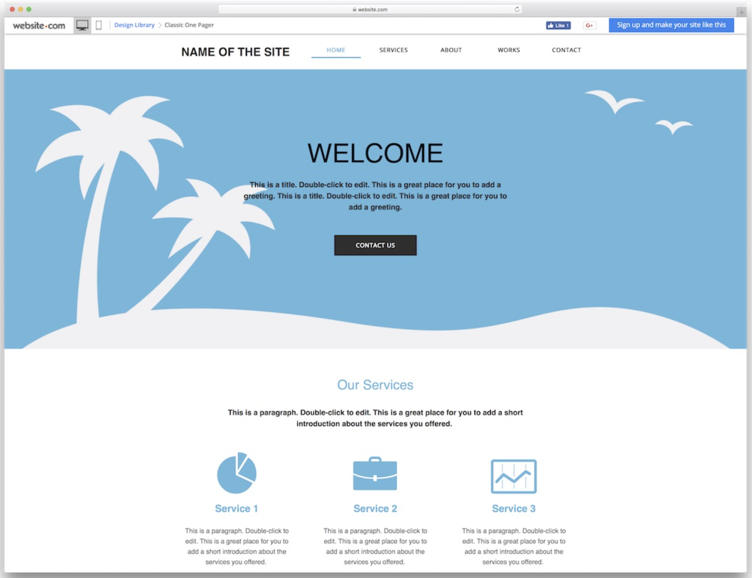
For instance, your visitors expect the name of your site at the top of your homepage along with the main navigation bar. Your homepage also should include a hero image with a welcome message to greet your visitors. As individuals scroll down the page, they should receive more details about your business. Here’s an example from ColorLib:
Deviating from standard conventions often causes mishaps in the user experience. So, you’ll want to stick to what your visitors know, rather than experimenting with unknown design elements.
7. Design compelling calls to action
A call to action helps visitors take the desired step on your website. It can appear in the form of a button, a link, or even an image.
You want visitors to take action to make a purchase, subscribe to a newsletter, or maybe watch a video. So, your goal is to design a persuasive call to action. Meiling Wu, a marketer, writer, and entrepreneur, suggests:
“Make it easy to find so that it will stand out from other links. Use bold colors that stand out from background colors, try to use colors that you never used anywhere else on the page.”
In addition, use an imperative statement, rather than a long descriptive text. You’re aiming for words, like: “Get started now” or “Create an account.”
Enhance the Design of Your Website With These UX Tips
The appearance of your website impacts the visitor experience. You can elevate your site’s design with white space, color consistency, and attractive calls to action.


![Yes, B2B Websites Can Use Personalization Too [Here’s How]](https://mdvirtue.com/wp-content/uploads/2022/02/Yes-B2B-Websites-Can-Use-Personalization-Too-Heres-How-400x250.jpeg)

0 Comments