You see a headline that strikes your interest, and you click to read the article. But before you even get through the first line—the content’s blocked with a pop-up. So annoying.
If you really want to read the article, you click the X and keep going. But if you were at all lukewarm on it, you think “screw this” and move onto the next thing on your busy to-do list.
Everyone hates pop-ups. We all complain about them. They’re intrusive and disruptive and just, well, annoying.
And yet they’re all over the web. For all that marketers and web designers talk about caring about the user experience, most are still using a tactic that consumers widely despise.
Why Are Pop-Ups So Common?
Pop-ups are still a mainstay on sites across the web because they get results. Most websites want to encourage visitors to take some kind of action, such as signing up for an email list or making a purchase. And for all that people complain about them, pop-ups are a surprisingly effective tool for driving these kinds of actions.
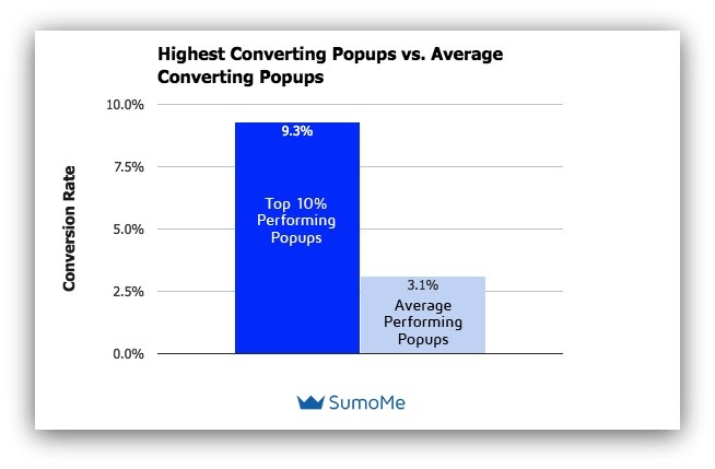
Sumo research found that pop-ups have over a 3% conversion rate on average, and closer to 10% for top performers.

So even though 73% of consumers in a HubSpot survey reported disliking pop-ups, marketers weigh the complaints against the likelihood of results, and many decide to risk using the unpopular tactic in exchange for the conversions it will achieve.
3 Reasons NOT to Use Pop-Ups
Even though they may lead to the email signups or purchases you covet, pop-ups aren’t always worth it. There are a few good reasons to forego them completely.
1. They annoy your visitors—especially on mobile.
Most websites don’t want to earn one-time visits. You want to earn loyal visitors that will come back again and again. That requires creating an experience they like enough to repeat. Using a tactic they find annoying is exactly the wrong way to do that.
2. They can increase bounce rates.
Every time your pop-up inspires a frustrated visitor to click away, you’ve lost them. In your analytics, that shows up as an increased bounce rate. But behind the data, you’ll never really know which of those bounced visitors may have liked your website enough to convert or come back later. When you work so hard to earn clicks to your site to begin with, why risk driving them away?
3. They send a message to visitors that you don’t care how they feel.
When a marketer weighs visitor annoyance against conversions and opts for the latter, they’re deciding the feelings of the many visitors who will be bothered by a pop-up matter less than the possibility of meeting their analytics goals.
And the thing is, your visitors get that. They know you know they don’t like those pop-ups, so your decision to include them is a signal that their opinion doesn’t matter to you as much as getting them to take the action you want them to.
7 Strategies to Use Pop-Ups Without Alienating Visitors
That may sound like a pretty compelling list of reasons to knock off using pop-ups altogether, and for a lot of sites that’s a good choice!
But as we’ve established, pop-ups have an annoying tendency to work. Many businesses that have tested them out find they convert well enough to make up for any increase in bounce rates or visitor frustration they may cause.
If you need those conversions for all the work you’ve put into building, maintaining, and marketing your website to pay off, then foregoing them completely may not feel like a feasible option. The better option may well be to find a way to include pop-ups that are less intrusive, and therefore won’t bother your website visitors. And you do have some solid strategies to accomplish this.
1. Do NOT use more than one pop-up per page.
This point should seem obvious, but all of us have been on websites where just as we finish closing the window for one pop-up, we’re immediately hit with a second. Yeesh. If that first one didn’t drive a visitor off the page, there’s a decent chance the second one will. People will be more forgiving of one pop-up than they will of two (or—god forbid—more than two).
2. Make the X easy to find.
While these days it’s fairly rare, you probably still encounter the occasional popup that uses tricks to make closing it difficult. That could mean putting the X in a different place than usual (the left upper corner rather than the right, for instance), or making its color close to the background color so it’s hard to see.
Frankly, these tricks make a website look sleazy. If a visitor comes to your website prepared to trust you and encounters sneaky pop-ups like this, you’ll immediately lose any possibility of trust.
Put a clear and obvious X in the top right corner where everyone expects to see it. In many cases, you’ll also want an additional button toward the bottom of the pop-up people can click on to say they’re not interested and close the window.
Making it easy for visitors to opt out of something they don’t want isn’t just a good practice in terms of staying reputable, it also means the conversions you do earn will be relevant, quality ones. Quality matters more than quantity here!
3. Make sure they don’t destroy the mobile experience.
Pop-ups are intrusive and frustrating on a desktop. But on a smartphone, which has far less screen real estate to start with, a pop-up that takes up most of it can absolutely wreck a visitor’s experience of your website. And now that mobile internet usage has overtaken desktop, a lot of your visitors will be interacting with your website on that small screen.
Test out any pop-up you add to your website on mobile. Make sure that it’s easy to close out on a small screen (that X needs to be big enough to press with a finger, not just a mouse), that it doesn’t slow down the site, and that it’s not popping up at a moment likely to make your mobile visitors rage.
4. Keep them out of the way.
Ok, think carefully: you think you hate pop-ups, but do you always? What you hate is being interrupted. You’re trying to read an article or browse an online store and BOOM! whatever you were trying to look at has now been blocked with a square bugging you to do something you don’t care about. That’s what people hate when they talk about hating pop-ups.
But when you’re reading an article and a little box slides into your view in the bottom corner of the screen—not blocking your view, but just catching your attention enough so that you know it’s there for when you want to look at it—do you hate that? You probably don’t mind it so much.
Adding pop-ups to your site in spots that aren’t intrusive is a smart way to find a happy medium. You’re not making your visitors mad, but you are giving them an obvious signal of what action you want them to take next. You can still get some of those conversions you seek, without risking customer sentiment in the process.
5. Consider context in where they show up.
Most pop-ups people hate are trying to convince visitors to do something the website owner wants, without considering what the visitors want. You want people to find your pop-up useful rather than annoying. That means trying to get inside their heads to figure out what you can offer at the right moment so that it’s something they want.
Don’t just throw the same pop-up on every page of your site trying to drive the same action you want visitors to take. Think about how you can add value based on what you know about what they’re thinking.
To start, match the offer in your pop-up to the page they’re on. If they’re reading a blog post about creating a personal skin care routine, a pop-up that points them toward your website’s skin care quiz helps them get a fuller answer to the question that led them to your post. If they’re browsing products, a pop-up that offers a discount for signing up for your email list makes sense, since they’re close to the point of buying.
With each page, consider what your visitors are thinking and feeling before you consider whether to add a pop-up, and what that pop-up should contain.
6. Avoid passive aggressive calls to action (CTAs).
A persistent pop-up trend that has inspired many an eyeroll is the passive aggressive CTA. When a website’s pop-up gives you a choice between taking the action it wants you to, or clicking a button that says something like “no, I hate adorable puppies” or “no, I like failing at my job,” the idea is that you’ll shy away from clicking on something you obviously disagree with.
But most people aren’t going to be more likely to do the thing you want them to just because you figured out a way to low-key insult them if they don’t. And if somebody does convert just because they don’t want you to think they hate puppies (or whatever your passive aggressive option is), what’s the likelihood they’re a genuinely interested and relevant lead?
This is another tactic that feels a bit like you’re trying to trick people, and it won’t earn you any points in customer sentiment. You’re better off sticking with straightforward CTAs.
7. Test out whether they’re worth it.
Just because research from other businesses says that pop-ups are worth it, doesn’t mean they will be for your business. Try them out. See if they lead to enough conversions to pull their weight, and if you see any noticeable difference in bounce rates. A/B test different designs, offers, and CTAs to figure out what your audience responds to.
You may find they’re not worth it after all. Or you may figure out that as long as you get it right, the results are everything you hoped for. The only way to know is to track your results as you go.
To Pop-Up or Not: The Decision’s In Your Court
Pop-ups are controversial, but they do serve a purpose. Many websites will decide they’re better off skipping them in order to keep the user experience and their relationship with visitors stronger. Others will decide smart pop-ups that aren’t intrusive are worth it for the conversions they deliver.
Whatever you do, avoid the sleazy practices the worst pop-up offenders traffic in, and keep the visitor experience top of mind in how you approach the question. Chasing conversions is never worth sacrificing trust.


![Yes, B2B Websites Can Use Personalization Too [Here’s How]](https://mdvirtue.com/wp-content/uploads/2022/02/Yes-B2B-Websites-Can-Use-Personalization-Too-Heres-How-400x250.jpeg)

0 Comments