

![What Makes a Great Social Media Graphic? [Checklist]](https://mdvirtue.com/wp-content/uploads/2020/05/What-Makes-a-Great-Social-Media-Graphic-Checklist.jpg "What Makes a Great Social Media Graphic? [Checklist]")
Did you know that nearly all (95.9%) bloggers promote their blog posts via social media? It’s with good reason too, considering the various social media platforms are THE hot spot for online engagement.
In fact, there are 2.45 billion active users on Facebook, 2 billion on YouTube, 1 billion on Instagram, and 340 million on Twitter. And, 86% of people using social media use it at least one time a day.
Here’s the hard truth, though. Just because people are following you, and you’re regularly sharing your blog posts on social media doesn’t mean that people will automatically click on your link and visit your blog.
To truly capture the attention of your social media followers, it’s imperative to follow social media and blogging best practices. One thing you can implement into your strategy right now is to create a great social media graphic—one that entices readers to click.
Designing a cool graphic is worth your time and will produce instantaneous results. Seriously. Images on Facebook constitute 93% of the most engaging posts, and using images in blog posts means 94% more views.
But what makes a great social media graphic, and how do you create one? This post will cover everything you need to do (checklist style) to create a visually appealing graphic for your social media posts.
Checklist: How to Make the Best Social Media Graphic
Before you press “publish” on your social media post, do yourself a favor and review the following checklist items.
1. Did I use the right dimensions on my graphics for each different social channel?
Have you ever come upon a social media post that has a great headline, but the image is too big or another sort of visual wonky? This is typically the result of including a graphic that isn’t the right size for a particular social media platform.
Here is a quick guide to dimensions to help you get it right.
Facebook shared image guidelines:
- 1,200 x 630 pixels
- Will appear at a max width of 470 pixels (will scale to a max of 1:1), and at a max width of 504 pixels (will scale to a max of 1:1) on page
Facebook shared link guidelines:
- 1,200 x 628 pixels is recommended.
- Square pic minimum is 154 x 154px in feed, and 116 x 116 on-page.
- Rectangular photo minimum is 470 x 246 pixels in feed, and 484 x 252 on-page.
- Facebook will scale photos that are under the minimum dimensions, but you can always increase image resolution at the same scale as the minimum size.
LinkedIn shared image guidelines:
- The recommended size for images or links is 1104 x 736 pixels but appears at 552 x 289 pixels.
- The maximum size for shared images is 1104 x 736 but may appear slightly cropped on a mobile device.
Twitter in-stream photo guidelines:
- Minimum to appear expanded 440 x 220 pixels (a 2:1 ratio).
- Aspect ratio = 16:9.
- Maximum to appear expanded 1024 x 512 pixels, and appears in-stream collapsed at 506 x 253 pixels on a desktop.
- The maximum file size is 5 MB for photos and 5 MB for animated GIFs on mobile and 15 MB on the web.
Instagram photo guidelines:
- 1080 x 1080 pixels, but Instagram scales these photos down to 612 x 612 pixels, and it will appear in feed at 510 x 510 pixels.
- For square or rectangle photos, the aspect ratio should be between 1.91:1 and 4:5 ratio.
- For portrait photos, the recommended dimensions are 1080 x 1350 pixels.
- Smaller featured header images appear as 204 x 204 pixels, and larger featured header images appear as 409 x 409 pixels.
Instagram stories photo guidelines:
- The recommended resolution is 1080 x 1920.
- The minimum resolution is 600 x 1067.
- The aspect ratio is 9:16.
- Max file size = 4GB.
These are the necessary dimensions. For more in-depth information about image sizes, check out this comprehensive post by SproutSocial.
2. Does the graphic use colors, fonts, and illustrations that complement your brand identity?
How weird would it be to see a picture advertising the new Apple iPhone that was red and yellow and looked like a McDonald’s ad? It would throw off all the lovers of classy, high-tech, right?
Your blog may not be as big as Apple or Mcdonald’s, but that doesn’t mean you can’t have a brand identity, and that you can’t optimize your graphics by maintaining a comprehensive look.
Before sharing your first post, remember to use colors, fonts, and illustrations that look like they came from your blog. Some bloggers will even add the URL of their blog to their image to promote their brand more effectively.
Seriously. Look how cool this image is from Making Sense of Cents.
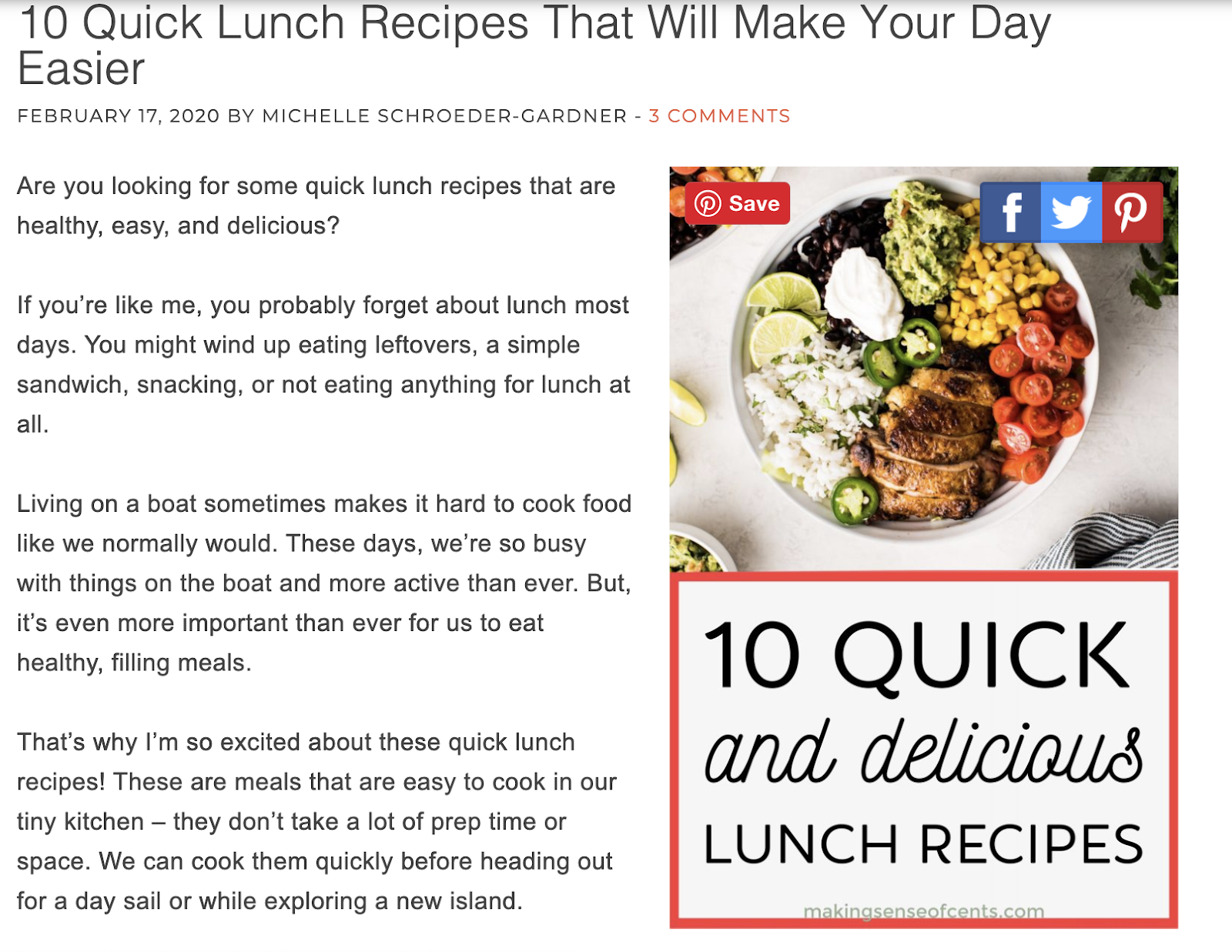
The image jives with the overall theme of Michelle’s blog. She includes her URL, so people know where the post came from, and she also ads an option where others can share her post via her image (another excellent strategy to boost blog traffic).
3. Did I sell my message visually?
Think about how long it would take to describe the room you are sitting in right now. Now think how long it would take to look at a picture of that room and understand everything you need to know about the room.
It only takes a few milliseconds to understand a visual message, and that’s why using graphics in your blog is so powerful. It’s also why billboards are a hit in the advertising world.
Not only is it easier for the human brain to process visual information, but stats show that humans recall information 55% more efficiently when it’s paired with a visual graphic.
What does this mean? It means don’t skimp on your graphics. Design your graphics in a way that they tell the same story of your post.
Let’s look at Social Media Examiner as an example. The Social Media Examiner content team works hard to include a visual graphic that explains every post.
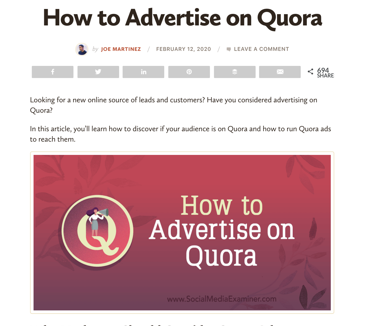
This blog post is on “How to Advertise on Quora.” The image sells the same idea with the cute design of the Quora logo and woman with the megaphone. In two seconds, you know what the post is about, and whether or not you want to click through to the story.
Also, notice the URL at the bottom of the image showing you the blog post is by Social Media Examiner.
4. Did I include my key message or CTA?
Not only do you want to make sure you tell the story of your post visually, but it also helps to include a key message.
The first strategy is to include the headline of your article in the blog post. The Social Media Examiner article, “How to Advertise on Quora,” pictured above, follows this strategy, and it works. The text tells you the central message of the article, complements the design, and quickly allows people who are following you that are interested in advertising on Quora to find you.
Another winning strategy is to include your call to action in your image. If you are trying to get your audience to do something, don’t be afraid to call attention to it in your excellent visual graphic.
Here is an excellent example from Whatfix.

This blog post is all about coming to a conference and meeting Whatfix. The team wants to meet people at Oracle OpenWorld, so that’s what the image tells people to do.
Creating a blog image with a call to action shortens and focuses your message. It’s a great way to help your audience recall your message.
5. Have I applied the essential elements of graphic design?
The best option is to hire a graphic designer to create your graphics. But, the reality is not every blogger has the budget to hire a designer.
The alternative is to learn some of the basic rules of blog graphic design and give it a whirl yourself.
Some pointers from Buffer include:
- Considering your color choices
- Following the rules of balance in design
- Use lines to tell your story
- Use serif fonts for print and sans-serif for the web
- Add contrast to your graphic
- Scale the most critical images
- Group similar items together
- Put the more important messages in a bigger font
- Use the same fonts, colors, and logos (we talked about this earlier)
- Understand how people read/look at pictures
- Use spacing to your advantage
Other ideas include browsing current web design trends on different platforms and scouring the internet for free design advice.
The best thing that I have personally found online for a writer trying to design images is Canva. Canva sizes images for you, provide free (and some paid) design elements and has a healthy amount of templates that you can customize to your liking.
Wrap Up
Including a social media graphic with every blog on your website is the way to go. Every time you create a graphic, refer to this checklist and make sure you’ve followed every step.
Remember, while you may need to design your blog graphics, you don’t need to design your website. When you purchase web hosting from Virtue Media, you get access to 200+ free templates and a drag and drop website builder.


![Yes, B2B Websites Can Use Personalization Too [Here’s How]](https://mdvirtue.com/wp-content/uploads/2022/02/Yes-B2B-Websites-Can-Use-Personalization-Too-Heres-How-400x250.jpeg)

0 Comments